Good textile choices can turn your house into a home. On the colour front, green is the theme for 2017, and it’s best paired with pattern and texture. By Ilze Hugo
Go green
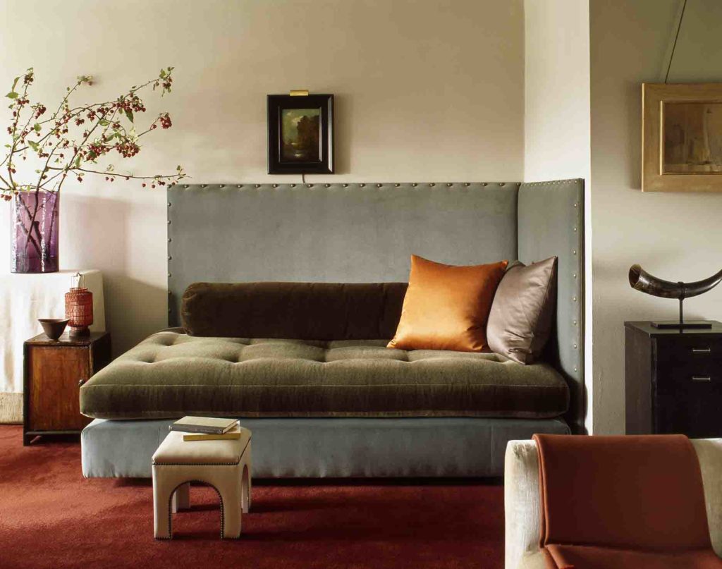
Colour authority Pantone’s Color of the Year is popular for being a reliable trend indicator. This year, Pantone has chosen Greenery – a hopeful shade inspired by nature and the quest for more sustainable living practices. As a result, we are seeing leafy, natural greens in different hues dominating textile trends. As a continuation of this, other earthy, natural colours are dominating too, says Cape Town architect Zeanne Duminy. ‘Think deep emerald, rich ochre, ruby red, travertine, cinnamon, olive and rust, with copper replacing gold and brass.’ (Plascon’s 2017 Terrain colour palette is an excellent example of these shades.) Monochromatic combinations and greys are still in vogue, warmed by blush pinks and copper hues, adds David Bellamy, proprietor of artisanal textile studio and curated fabric retailer bbellamy & bbellamy, ‘but the front runners are still sapphire blue and forest-like green.’ The green theme is spilling over into fabric types and prints. ‘Natural fabrics with natural textures are favourites,’ says Anne Richardson, owner of Cape Town’s Annapatat (manufacturers of hand-printed artisanal fabrics and suppliers of upmarket local printed textile brands such as Skinny laMinx). There’s a push towards ‘the use of natural, biodegradable fabrics, and locally produced studio and artisanal fabrics that give your home a sense of specificity and place,’ explains Bellamy. ‘For example, linen is very strong and long lasting, with a luxurious handle. Its natural grey/green/taupe hue is beautiful and – compared to cotton – its production uses less water and pesticides.’ Print-wise, think along the lines of bold leaf designs, particularly with a hint of local flavour, such as fynbos, says Richardson. ‘Nature-inspired prints are here to stay for a while,’ agrees stylist and blogger Kim Gray, ‘whether it’s leaf motifs, florals or birds.’ Two of last year’s favourites – the flamingo and pineapple – are being replaced with more adult motifs, says Duminy. ‘Think parrots, rich jungle themes and African animal safari prints.’ Duminy says, ‘We’re also seeing a revival of Art Deco- and Seventies-inspired patinas and patterns.’ Other print trends that you can always feel safe with are classics such as geometrics (minimalist or tribal), stripes and monochromes, says Gray. vote for velvet Tactility is another trend, says Duminy. ‘The home is a sanctuary that provides us with warmth and indulges our senses, and tactile textures add to this experience.’ Natural textures dominate, says Richardson, but we are also noticing a small glint of metallic accents. Velvet is a major trend right now, both in decor and on the fashion runways. ‘We are seeing a re-emergence of rich velvet in the most beautiful colours, along with raw linen and beautiful sheers to set it off,’ says Duminy. ‘Cotton velvet is huge right now,’ explains Bellamy, ‘chiming quite well with the interest in the mid-century period and colour-blocking.’
Invest in a rug
A trend that’s really catching Gray’s eye is beautiful rugs. ‘I love Moroccan-inspired ones – from black-and-white traditional Berber rugs to brightly patterned pieces. They really cosy up a home with their rugged textures.’ Don’t be shy to layer. Another trend is fabric storage baskets. ‘Skinny laMinx, Zana and iSpy are all using soft fabric buckets for pot plants, knitting or office staples.’
Mix and match
Textiles are great for adding comfort and warmth to a room, says Richardson. ‘I’ve just read a book on hygge [a Scandinavian concept of cosiness], The Little Book of Hygge: The Danish Way to Live Well, and blankets and throws are key in creating a cosy atmosphere,’ says Gray, who keeps a few folded in a big basket for easy access when it’s time for movies on the couch. ‘Drape a statement throw over the back of a couch (I love Karien Belle’s Poetry scarves/throws, and the throws and blankets from Mungo Design), or use an interesting rug or piece of fabric as a wall hanging.’ When layering textiles, choose a strong, simple colour scheme to effectively hold different textures and prints together: mix and match prints as long as you’re tying in a general colour scheme, or vice versa, says Gray. ‘Skinny laMinx is a great example of a fabric designer whose designs all mix and match, whether you’re sticking to a floral print in various colours or using a selection of prints in shades of green, yellow and blue, for example. For my
own home, I chose black, white, wood and tan leather as my base colours and brought in accents of colour through
kilim cushions, African baskets and my mustard Ikea couch. My kilim cushions are a mix of stripes and pattern, but there is an underlying pink theme tying them all together.’ Avoid using too many different styles. ‘Try sticking to a theme, such as beach house, Scandi-inspired or African nomad. ‘Always have one or two strong focal points that complement everything else in the room,’ says Richardson. ‘Too many statements cause confusion, but a lack of focal points creates a very bland look.’ Instead of mixing up various prints, you can also combine plain fabrics with contrasting textures to nicely accentuate the tactile property of fabric, bringing an interesting sensory element to your space. ‘Natural matt linen with a shimmer of velvet makes for an alluring combination,’ she says. Swap scatter cushions and throws to give your home a fresh seasonal update, says Bellamy. ‘For example, choose summer cushions in shades of white, green and blue, and winter ones in shades of brooding grey, red and purple that couple well with cosy log fires.’ Bring in interesting pieces of fabric from your travels, whether beautiful saris, African wraps or Balinese ikat runners, as wall pieces or turned into cushion covers. ‘I love it when items hold memories and experiences. I think it brings a lot more soul into one’s home than walking into a mass retail store and buying for the sake of it.’
Upholstery 101
Keep in mind how much the item will be used. ‘Heavy-use items need a durable fabric. Consider loose covers that can be washed periodically. And think about fabrics that will patinate, meaning they become more beautiful over time or with wear, such as quality natural linens.’– David Bellamy, bbellamy & bbellamy ‘Check the rub count (it should be on the information sticker on the back of the fabric sample). The higher the rub count, the stronger the fabric. And don’t be put off by fabric that contains polyester. Once a dirty word in textiles, polyester has come a long way and can have a very natural look and feel while adding strength and colour fastness to fabrics.’– Anne Richardson, Annapatat ‘Ask for swatches and view these in the correct light and surrounds. Query the fabric’s durability and its fading quality, especially if it is going to be used in an area with lots of direct sunlight.’– Zeanne Duminy, architect
Window-treatment tips
Used in a minimal way, fabric blinds and curtains are still on trend. But no braids, scalloped edges, frills or flounces, says Anne Richardson of Annapatat. ‘Use a good polycotton rather than a cotton lining on Roman blinds and curtains. The polyester in the blend is resilient to our harsh South African sun, and curtains and blinds will last longer.’ Curtains or blinds? It depends on the home, says stylist and blogger Kim Gray: ‘For a minimalist, city apartment I’d go with neat blinds, choosing a bold print such as Skinny laMinx’s Solid Orla. For a larger home, beach house or country home, soft billowing curtains add romance and softness and can make the most gorgeous accent feature in a room. I love Lula Fabrics’ soft textured, plain or floral linens.’
Photography: gallo/gettyimages, greg cox/bureaux.co.za